Wednesday 16 December 2009

Evaluation.

How does your media product represent particular social groups?

I think my magazine represents young girls mostly. Most pop magazines were aimed at young/teenage girls, so they are the one's that pop magazines would have to represent. Young girls can relate to the people featuring in the magazine therefore I think the social group I have represented are young/teenage girls. Past pop magazines have also represented this particular social group as most of the covers I have researched either have male artists on that girls would have found attractive, or female artists that girls would have found iconic.
What kind of media institution might distribute your media product and why?
I think Bauer Music Group would distribute my magazine as this conglomerate distributed Smash Hits magazine until 2006. There is a gap in the market for Pop music, most of the music magazines that Bauer distribute now are quite 'individual' magazines. However, I think that because there has been such a drought of Pop magazines I think Bauer would distribute my magazine to satisfy Pop fans needs as there not being satisfied at the moment.

Who would be the audience for your media product?

I chose teenage/young girls for my target audience as they are more likely to be into Pop than any other social group. And as a Pop fan I decided to create a Pop magazine as I am more likely to know what a fan of Pop would expect to see in a magazine than a person who was a fan of Rock or Indie music. I have put bright, bold fonts on my magazine to attract the female audience and the artists that I have featured on the contents page are quite popular in terms of contemporary Pop music. My magazine is called 'Pop' so I think it's obvious what genre of music is in my magazine therefore the average Pop fan would buy my magazine as there are hardly any, if any, Pop magazines still out today.

What have you learnt about technologies from the process of constructing this product?

In terms of technology, I feel I have learned how to use a camera properly. I can take professional looking pictures now by using proper lighting and mise en scene. The mise en scene for my picture centered around colour and brightness. Because it's a Pop magazine I needed things too look happy with my mise en scene, so I chose a brightly lit room and asked my models to wear bright clothes. I found it hard to capture a decent picture at first. But as I learnt more about cameras and technologies I was able to take better more professional pictures. For my preliminary task my shots were quite face on and I had to create light on photoshop instead using the natural light properly.

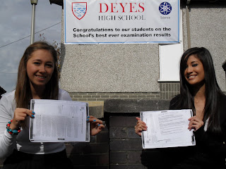
Looking back at your preliminary task, what do you feel you have learnt in the progression from it to the full product?

In terms of progression, I think I have came a long way from my preliminary task. In the process of doing my preliminary task I had to edit the picture using photoshop, and I didn't know how to use it, I added light and changed the paper into certificates, but thats all I was capable of back then and I used Microsoft Publisher for both my front cover and contents page mock up. But now on my main task, I edited all of my images on photoshop, cropped them, added shadows where needed and changed the lighting slightly. Also, my front cover, contents page and double page spread are all done on photoshop and I think it looks a lot more professional than my preliminary task.

Double page spread

The conventions I have used that other magazines have used are the use of columns for each section. I have used a big title to introduce the band which stretches to the next page, which I found is often used is magazine double page spreads. Also, after research, I have found that most magazine's tend to have one main picture and a few other smaller pictures, I have also used this convention. And I have started the article by setting the scene and finished it by looking into the future and have included snipets of an interview in between the article which is another convention I have used. However, most magazines tend to stick to one colour of font for the article, I have three colours, but the reason for this was if I kept it all black the consumer wouldn't be able to read the middle two columns so I changed them both to pink to match the title, but then I couldn't read the third column so I had to change that and I used purple as I also used that in the title. Also, the main picture is formed out of three separate images which challenges most magazine conventions as it's normally just one image, but I chose to use separate images as I wanted it to look a bit quirky and different from other magazines.

Contents


My magazine uses a lot of conventions that the 'Smash Hits' magazine contents page uses. I have set out the pages in blocks as the real magazine did. I have different subtitles for different blocks as the 'Smash Hits' did and each block is a different bright colour against a dull background. Also, I have included a competition in which the audience could win Katy Perry tickets, the Smash Hits have included a contests block and they have free posters within the magazine which is another shared convention with Smash Hits. However, my blocks have a different logo type image which I think would attract the consumer to each page. I also only used one picture to show what the poster would be, whereas the Smash Hits contents has used several to show who will feature in their magazine, I think if i used this convention my contents would look crowded so I decided not to use it.

Magazine Front Cover.


My magazine uses some of the conventions used in the 'Smash Hits' magazine. For example, both magazines have a bold title that stretches across the top of the page. I have chosen to crop one image so that each of the girls where closer together, however they are on different levels and have completely different, colourful looks and are posing differently, this convention is also used is Smash hits, as all of the members of the band are on different levels and are also posing differently and all look different. I have also used a circle to highlight a free poster that is available within the magazine as Smash Hits does. I have also used different colours to indicate some of the contents of the page which is another shared convention. However, I feel I have challenged some conventions of this magazine as I feel I used brighter colours to present the pop genre, my title, puffs and image stand out better than those of the Smash Hits magazine. Although the Smash Hits magazine has more puffs, I think that if I used that convention my magazine would look overcrowded and tacky therefore I chose not to use that convention.

Monday 26 October 2009

Deconstruction of Q magazine.


The title of the magazine 'Q' stands out as it takes up about 1/9 of the whole front cover and as the picture background is grey the red of the title background contrasts well and stands out vastly among everything else. The image of the front cover is Lily Allen, the picture would be seen by feminists as subject to the male gaze, as she is standing without a top on and looking seductively over her shoulder. 'Q' like many other magazines owned by Bauer Music Group are advertised as men's magazines, so by choosing this image for the front cover of Q was a clever move by Bauer as men would buy it as they might develop a fetish for her, as Laura Mulvey points out, Lily is celebrated on this magazine for her looks and nothing much else as it mentions nothing of her music.
The masthead of this magazine, 'SEXY BEAST LILY ALLEN' suggests that she is seen as a sexy object and is not not recognised for her music but for her looks. According to Richard Dyer's star theory, star's are images not real people, this image represents this theory as she is there to attract the consumer, the image is not representative the population of women in Britain and would therefore leave men with a fantasy of slim women when as Cohen's moral panic would imply, weight related issues for woman today are exceedingly frequent. The anchorage text for the image is '& her WICKED, WICKED ways...' this explains why there are two panther's with Lily in the image, suggesting that she is fierce like the panther's as she is posing amongst them. The repetition of the word 'wicked' sounds almost sexy in itself, men would buy the magazine to read about what these wicked ways are. The puff's on the right hand side and the bottom of the magazine include 5 rock bands suggesting, with the exception of pop singer, Lily Allen who's purpose in the magazine may have nothing to do with her music, that the magazine is mainly a rock magazine. One puff also says '& the hardest working corpses in music', this would intrigue consumers as they would want to know who and how they could be still hard working and dead. The cover also advertises 'The 25 greatest rock movies', so for this maybe rock fans would go out and buy these films which could lead to the Bauer Music Group receiving more money as they might get commission for these films as they advertised them.

Thursday 22 October 2009

Deconstruction of a NME front cover.


The title of the magazine 'NME' stands out as it is big, bold and the colours are red and white which contrasts against the black background, these are NME's signature colours and are seen on every NME magazine. New Musical Express implies that they are a unique magazine and offer a musical experience that no other magazines offer. The puffs at the top of the page are advertising 'THE WORLD'S GREATEST ROCK FESTIVAL'; Reading and Leeds. These inform the reader of what bands are to feature in both the magazine and the festivals. The colours that they have used are yellow, red and white still against the black background, this would attract the reader's eye as all of the colours contrast against the black. The puff also says '+ more' at the end making the reader want to buy the magazine to see who else if featured in the magazine and at the festivals. The cover names the band The Killers as the main featuring article, but only mentions and shows pictures of the lead singer which suggests that there is little demand to see or hear from other members of the band. It also has a quote from the article 'I'm having a personality crisis right now...' the ellipses at the end would make the reader want to read on and find out why he's having a personality crisis. 'Can Brandon find the plot in time for Reading & Leeds?' This puff would make the reader want to buy the magazine to find out what's wrong with him and if he'll still be able to play at Reading and Leeds. The cover also features another puff about V festival, it states that there is a review of the festival inside, and mentions The Verve from which it goes on to say 'how it all went down'. The reader would want to buy the magazine then to see 'how it all went down' at V festival.

Preliminary Contents Page.


This is my preliminary task contents page mock-up. If I were to do a real contents page, I would do the masthead, 'Deyes High News', red, blue and black and use Edwardian Script ITC for 'Deyes High' and Century Schoolbook for 'News' to match the front cover because they are the schools signature colours and I would like the contents page to match the front page. The school badge will be the badge from the front cover. The outline of the box with the contents pages 3-6 will be red and the outline of the box with the contents pages 7-12 will be blue, this is to match the school colours and to make it more colourful for younger readers. The outlines of the images will just stay black, though, so the colours don't clash and it will still look quite sophisticated for the parents. The images would be of students working in the new science labs, an image of the school concert, which matches a puff that featured on the front cover, and an image of students working on the new computers in the library as these images match the contents that are likely to be seen in a school magazine.

Thursday 15 October 2009

Preliminary Front Cover.

I have used two fonts for my Masthead 'Deyes High School' to make it fun and to appeal to pupils but I have used quite sophisticated fonts, Century Schoolbook for 'Deyes High' and Edwardian Script ITC for 'News', this was to appeal to the parents also. I used a red and blue colour theme as these are the Schools' signature colours. I used the 'star' to make the magazine look more modern and for the main story of the magazine stand out. This story links to the picture with the girls holding the certificates for their achievements, so the audience will know that the main story is about the results that the pupils received. I have also included another puff about a school charity event, this is to inform parents of the success of both pupils and parents combined in raising £900 for charity.


Thursday 8 October 2009

Before & After Photographs.


This is the picture I chose for my Preliminary task front cover. However, I found a few flaws with the picture though, for example, the whole left side of the picture has a low contrast and it is blatant that we used someone's work to hold up as certificates instead of actual certificates. So I spent a while editing the picture on photoshop to try and get rid of these flaws and make the picture look a bit better and a bit more professional.


This is the finished picture. I made the left half of the picture lighter and made certificates out of the work. I am aware that the 'certificates' are different colours but I was trying to make a distinguished difference between the GCSE certificate on the left and the A Level certificate on the right.


I will post my preliminary front cover complete with my picture shortly.

Tuesday 29 September 2009

Mock Up.


This is a mock up of my preliminary task front cover. I haven't taken any pictures that I'd like to put in the square box in the middle yet. I would appreciate any feedback on this post. Thanks :)

Friday 25 September 2009

Rachel Waring's AS Foundation Portfolio :]

Welcome to my blog!


In this blog I will be recording all the work I will be doing and have done so far for my AS Media portfolio.

I will updating every few days with more progress so feel free to comment on my work and take part in my polls.

In my preliminary task I will be producing a School magazine cover and contents page, I would be grateful for any feedback that you may have on any of the work that I post on my blog.

In my main task I will be producing a front cover, contents page and a double page spread of a music magazine. I need to take a medium shot, I will take a few and post them to see which one you feel is the best.

Thanks.