Monday 26 October 2009

Deconstruction of Q magazine.


The title of the magazine 'Q' stands out as it takes up about 1/9 of the whole front cover and as the picture background is grey the red of the title background contrasts well and stands out vastly among everything else. The image of the front cover is Lily Allen, the picture would be seen by feminists as subject to the male gaze, as she is standing without a top on and looking seductively over her shoulder. 'Q' like many other magazines owned by Bauer Music Group are advertised as men's magazines, so by choosing this image for the front cover of Q was a clever move by Bauer as men would buy it as they might develop a fetish for her, as Laura Mulvey points out, Lily is celebrated on this magazine for her looks and nothing much else as it mentions nothing of her music.
The masthead of this magazine, 'SEXY BEAST LILY ALLEN' suggests that she is seen as a sexy object and is not not recognised for her music but for her looks. According to Richard Dyer's star theory, star's are images not real people, this image represents this theory as she is there to attract the consumer, the image is not representative the population of women in Britain and would therefore leave men with a fantasy of slim women when as Cohen's moral panic would imply, weight related issues for woman today are exceedingly frequent. The anchorage text for the image is '& her WICKED, WICKED ways...' this explains why there are two panther's with Lily in the image, suggesting that she is fierce like the panther's as she is posing amongst them. The repetition of the word 'wicked' sounds almost sexy in itself, men would buy the magazine to read about what these wicked ways are. The puff's on the right hand side and the bottom of the magazine include 5 rock bands suggesting, with the exception of pop singer, Lily Allen who's purpose in the magazine may have nothing to do with her music, that the magazine is mainly a rock magazine. One puff also says '& the hardest working corpses in music', this would intrigue consumers as they would want to know who and how they could be still hard working and dead. The cover also advertises 'The 25 greatest rock movies', so for this maybe rock fans would go out and buy these films which could lead to the Bauer Music Group receiving more money as they might get commission for these films as they advertised them.

Thursday 22 October 2009

Deconstruction of a NME front cover.


The title of the magazine 'NME' stands out as it is big, bold and the colours are red and white which contrasts against the black background, these are NME's signature colours and are seen on every NME magazine. New Musical Express implies that they are a unique magazine and offer a musical experience that no other magazines offer. The puffs at the top of the page are advertising 'THE WORLD'S GREATEST ROCK FESTIVAL'; Reading and Leeds. These inform the reader of what bands are to feature in both the magazine and the festivals. The colours that they have used are yellow, red and white still against the black background, this would attract the reader's eye as all of the colours contrast against the black. The puff also says '+ more' at the end making the reader want to buy the magazine to see who else if featured in the magazine and at the festivals. The cover names the band The Killers as the main featuring article, but only mentions and shows pictures of the lead singer which suggests that there is little demand to see or hear from other members of the band. It also has a quote from the article 'I'm having a personality crisis right now...' the ellipses at the end would make the reader want to read on and find out why he's having a personality crisis. 'Can Brandon find the plot in time for Reading & Leeds?' This puff would make the reader want to buy the magazine to find out what's wrong with him and if he'll still be able to play at Reading and Leeds. The cover also features another puff about V festival, it states that there is a review of the festival inside, and mentions The Verve from which it goes on to say 'how it all went down'. The reader would want to buy the magazine then to see 'how it all went down' at V festival.

Preliminary Contents Page.


This is my preliminary task contents page mock-up. If I were to do a real contents page, I would do the masthead, 'Deyes High News', red, blue and black and use Edwardian Script ITC for 'Deyes High' and Century Schoolbook for 'News' to match the front cover because they are the schools signature colours and I would like the contents page to match the front page. The school badge will be the badge from the front cover. The outline of the box with the contents pages 3-6 will be red and the outline of the box with the contents pages 7-12 will be blue, this is to match the school colours and to make it more colourful for younger readers. The outlines of the images will just stay black, though, so the colours don't clash and it will still look quite sophisticated for the parents. The images would be of students working in the new science labs, an image of the school concert, which matches a puff that featured on the front cover, and an image of students working on the new computers in the library as these images match the contents that are likely to be seen in a school magazine.

Thursday 15 October 2009

Preliminary Front Cover.

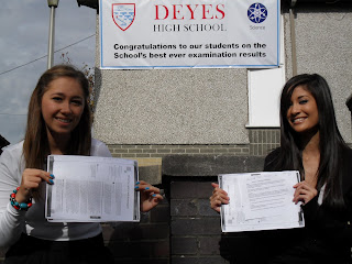
I have used two fonts for my Masthead 'Deyes High School' to make it fun and to appeal to pupils but I have used quite sophisticated fonts, Century Schoolbook for 'Deyes High' and Edwardian Script ITC for 'News', this was to appeal to the parents also. I used a red and blue colour theme as these are the Schools' signature colours. I used the 'star' to make the magazine look more modern and for the main story of the magazine stand out. This story links to the picture with the girls holding the certificates for their achievements, so the audience will know that the main story is about the results that the pupils received. I have also included another puff about a school charity event, this is to inform parents of the success of both pupils and parents combined in raising £900 for charity.


Thursday 8 October 2009

Before & After Photographs.


This is the picture I chose for my Preliminary task front cover. However, I found a few flaws with the picture though, for example, the whole left side of the picture has a low contrast and it is blatant that we used someone's work to hold up as certificates instead of actual certificates. So I spent a while editing the picture on photoshop to try and get rid of these flaws and make the picture look a bit better and a bit more professional.


This is the finished picture. I made the left half of the picture lighter and made certificates out of the work. I am aware that the 'certificates' are different colours but I was trying to make a distinguished difference between the GCSE certificate on the left and the A Level certificate on the right.


I will post my preliminary front cover complete with my picture shortly.